
Wok And Grill House - Restaurant Logo & Brand Identity Design
Project Overview
Wok And Grill House needed a logo that could anchor an Asian fusion dining brand in Salmiya, Kuwait — one that communicated culinary boldness, cultural warmth, and premium quality in a mark versatile enough to carry across signage, menus, packaging, and digital platforms.
Requirements
- ✦A distinctive logo mark suitable for an Asian fusion restaurant serving Chinese, Japanese, Thai, Teppanyaki, and Seafood
- ✦Strong visual identity that works across dark and light backgrounds
- ✦Typography that balances character and readability at all sizes
- ✦Culinary iconography embedded naturally into the mark without feeling literal or generic
- ✦A colour palette that conveys premium dining, energy, and cultural richness
Client
Wok And Grill House
Kuwait
Industry
Food & Beverage
Services
Technologies & Tools
Problem Statement
- Asian fusion restaurants in the Gulf market frequently use generic chopstick or dragon iconography that fails to differentiate one dining brand from another.
- The restaurant name combined two distinct culinary concepts — wok-based Asian cooking and open-flame grilling — and the logo needed to represent both without visual contradiction.
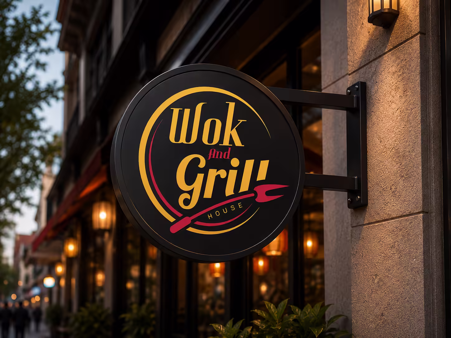
- The brand required a mark that could feel premium enough for a dine-in restaurant experience while remaining bold enough to read clearly on outdoor signage, menus, and packaging.
- Typography needed to carry personality and cultural warmth without sacrificing legibility at small sizes or on digital platforms.
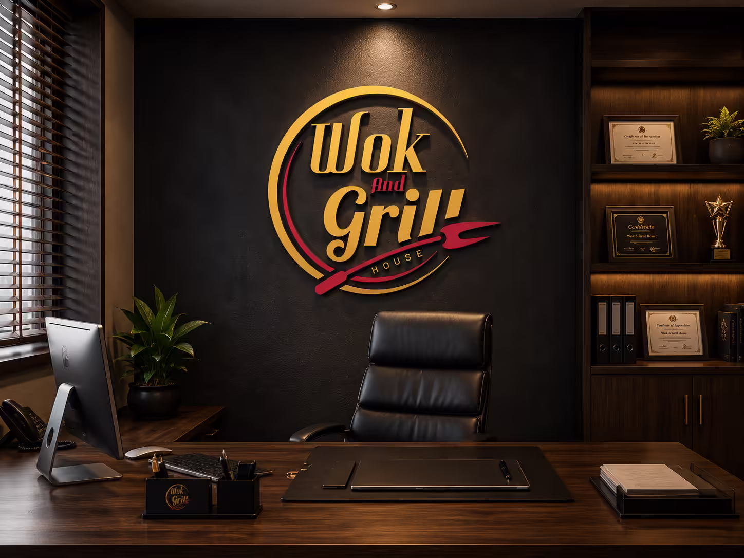
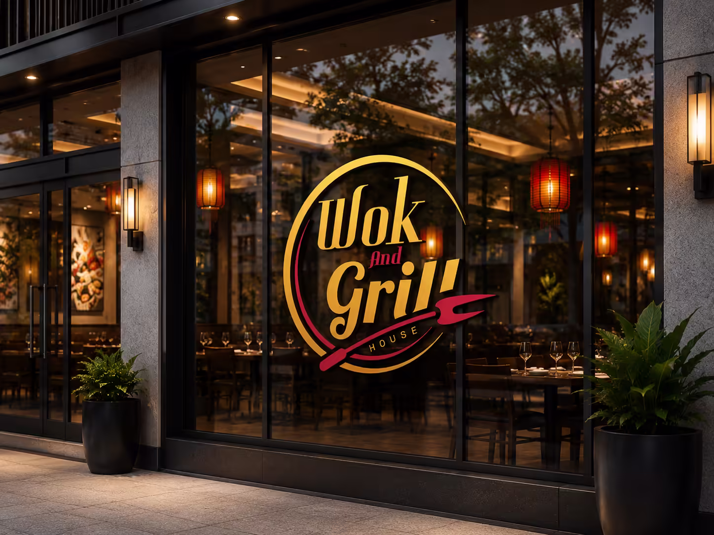
- The identity had to work convincingly on a dark background — the primary brand environment — while also remaining clean and usable on light surfaces.
Solution & Results
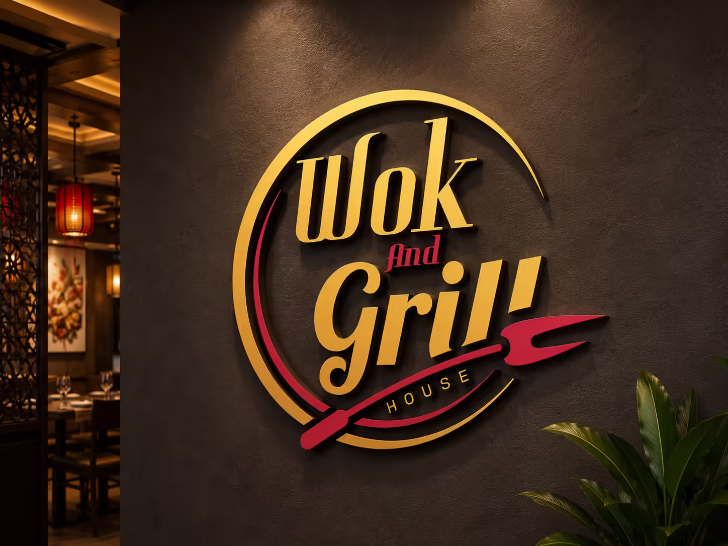
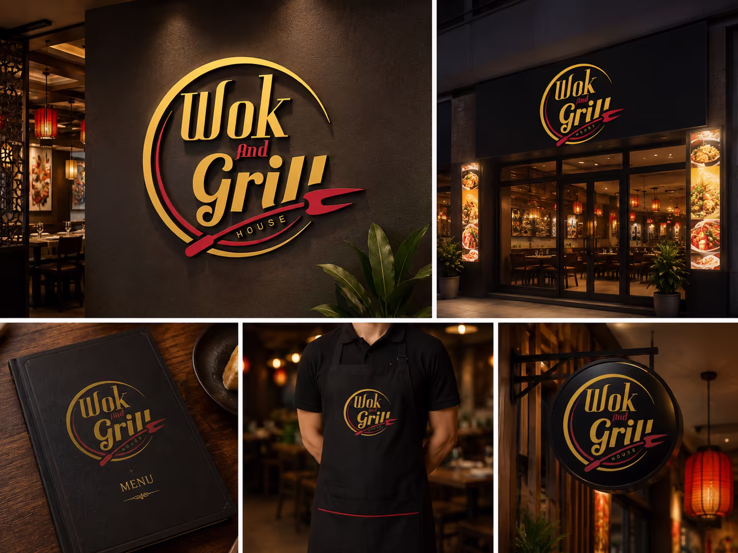
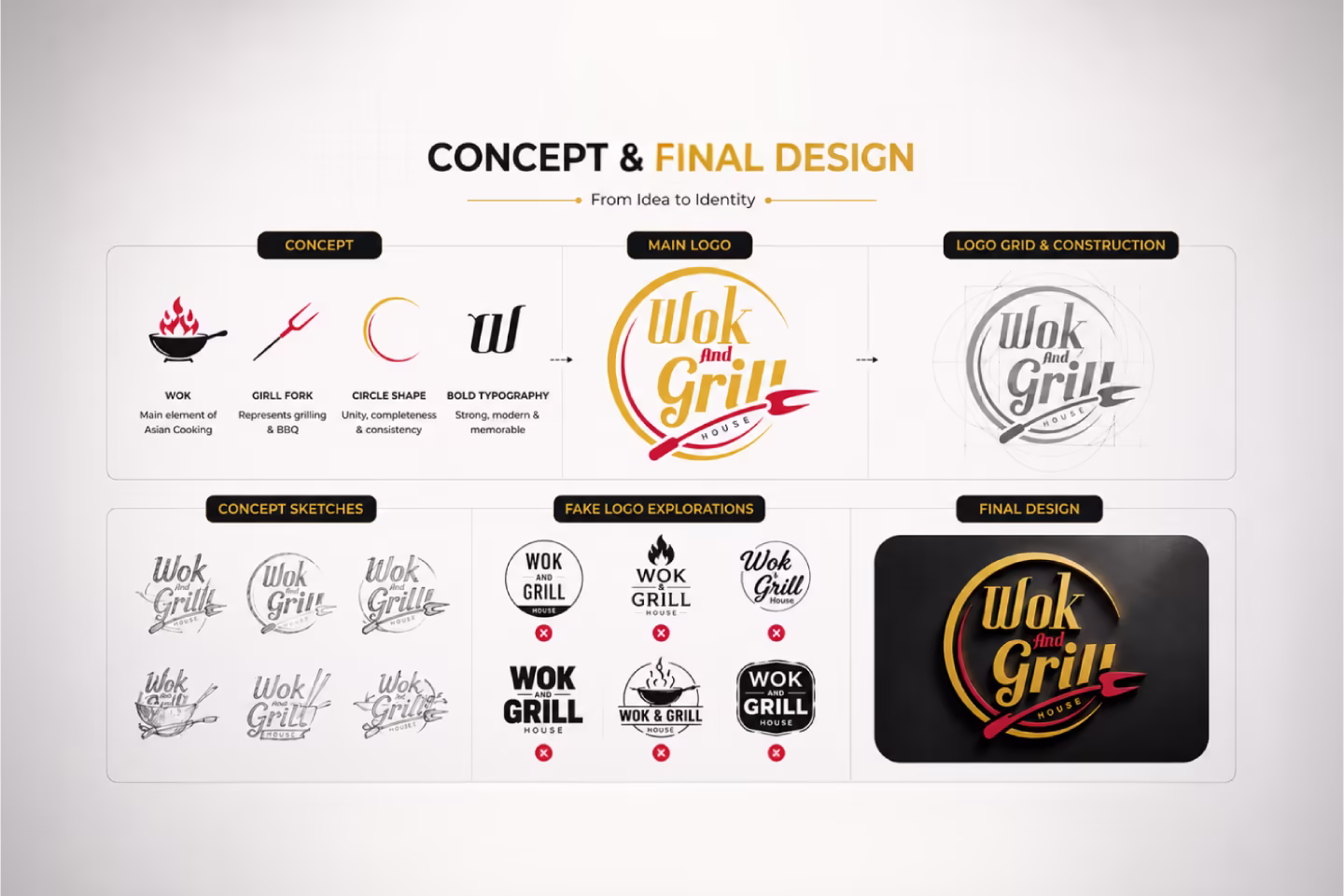
- Designed a circular emblem using a golden ring that evokes both the shape of a wok viewed from above and the universal symbol of a complete, established brand.
- Integrated a crimson spatula and barbecue fork as a diagonal design element cutting across the circle — merging the wok and grill concepts into a single visual gesture rather than illustrating them separately.
- Set the primary wordmark in a bold serif-influenced display typeface with irregular baseline weight and slightly condensed proportions, giving the lettering a handcrafted premium quality without sacrificing presence.
- Used "And" in a contrasting crimson italic script, creating a colour and weight break that adds rhythm to the wordmark without requiring a separate line or element.
- Placed "House" as a spaced uppercase label within the lower arc of the circle, completing the emblem structure and establishing the brand's positioning as a destination rather than a fast casual outlet.
- Built the entire mark on a rich black ground with gold and crimson as the only accent colours, creating a palette that reads as bold, premium, and culturally resonant across Asian dining contexts.
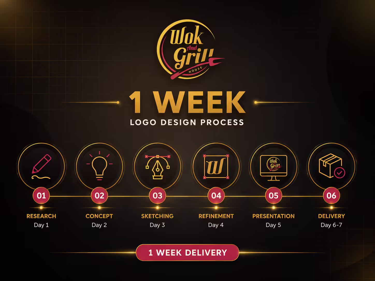
Design Process
The design process began with understanding the dual culinary identity — wok-based Asian cooking and open-flame grilling — and finding a single visual system that could hold both without forcing either. Circular emblem structures were explored as the primary format given their versatility across signage, packaging, and digital avatars. Multiple typographic directions were tested before settling on the bold display serif with the crimson script break for the connector word. The spatula and fork were refined across several iterations to ensure they read clearly as culinary tools at multiple sizes while functioning as a dynamic compositional element rather than a literal illustration.
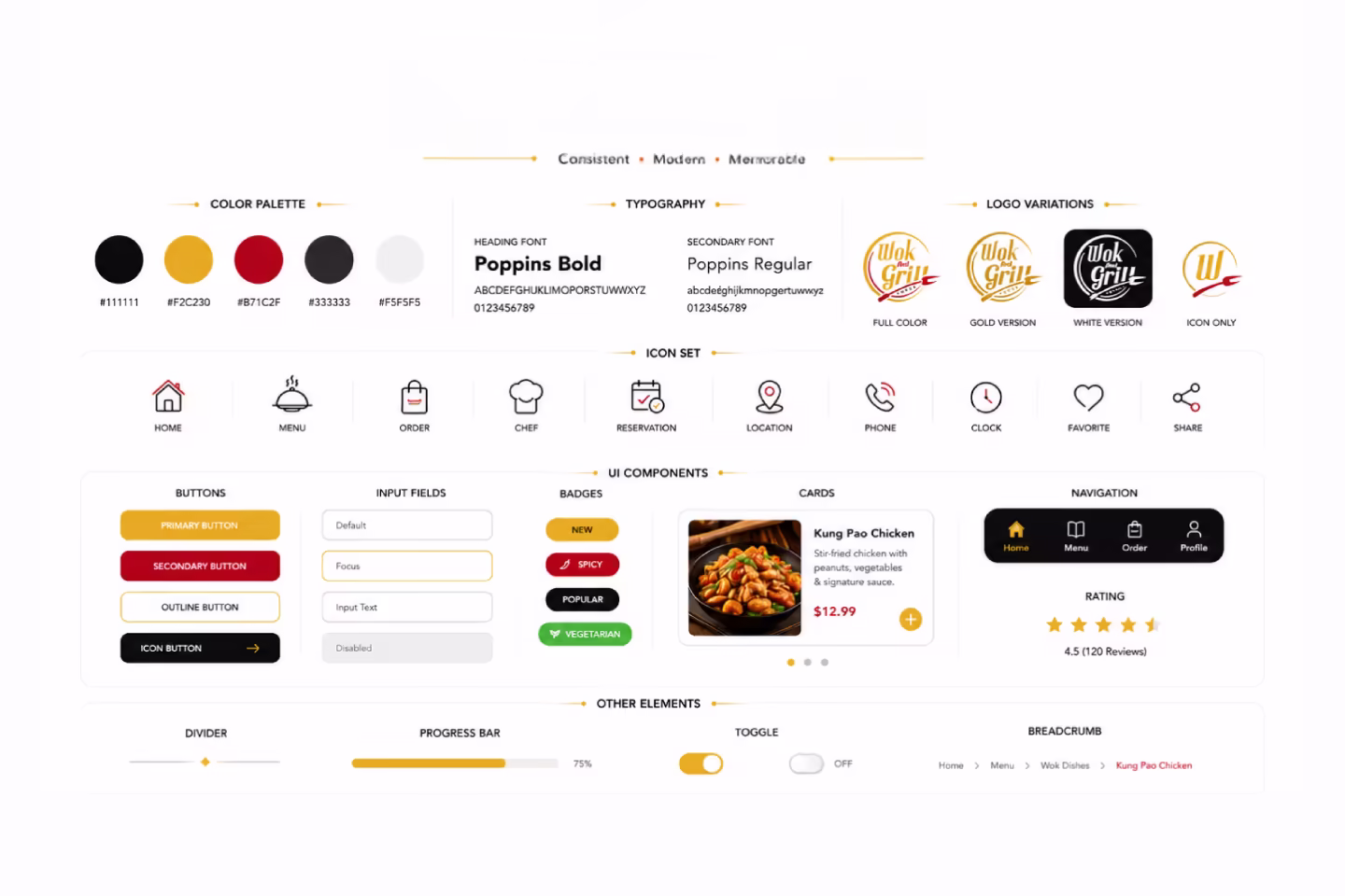
Style Guide & Components
The colour system uses three values exclusively — rich black as the primary brand ground, golden yellow for the wordmark and circular frame, and crimson for the connector script and culinary tool elements. This three-colour constraint gives the mark immediate visual clarity at any scale. The display typeface carries weight and personality in the primary wordmark, while the spaced uppercase treatment of 'House' in the lower arc adds refinement without competing with the boldness above. The crimson spatula and fork element functions as both a brand icon and a compositional anchor, keeping the eye moving through the mark naturally.
Concept & Final Design
Initial concepts explored standalone typographic marks, illustrated wok icons, and combined emblem formats before the circular system was confirmed as the strongest direction. The circular frame was refined to feel open and energetic rather than heavy or enclosed — achieved by slightly breaking the ring geometry where the spatula element intersects. Final files were delivered in AI, EPS, PNG, and SVG formats across dark, light, and transparent background variants, with clear size guidance for signage, print, and digital use.
Client Feedback

Masud is truly a high-level logo designer. He understood our brand perfectly and delivered a design that represents Wok And Grill exactly the way we imagined it. I can definitely hire him for our restaurant's next work.
Raisul Islam
General Manager, Wok And Grill House